
DESIGN
Mix & Match with
Studio Roslyn
By Kate Snyder
Kate Snyder, co-founder and principal of Studio Roslyn, a Vancouver-based interior design
and creative consulting studio, unveils the secret of her design alchemy by emphasizing the art of mixing and matching Fable dinnerware to craft a tablescape that tells a rich and vibrant story.
At the heart of this maximalist tablescape lies the principle of eclectic layering, where the pieces are chosen not merely for their adherence to a singular theme but for their ability to coalesce in a harmonious symphony. The touch of the unexpected is Roslyn's signature move, introducing an element of surprise that elevates the entire dining experience.
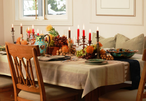
The starting point for this tablescape was Fable’s hand-finished ceramics in two colors, The Dinner Plates in Midnight Blue and The Dessert Plates in Beachgrass Green. A simple way to dive into the world of mixing and matching is to pair a deep color with a lighter tone. From there, I layered a variety of textiles that had similar Midnight Blue and Beachgrass Green tones in them. The tablecloth is a beautiful handmade block-printed textile from Studio Ford. The dark navy blue runner down the center of the table is an antique Japanese obi (a red obi box is the platform for the grape and floral centerpiece by Marta Sanderson of La Bomba Floristry). The base is set with the main players from Fable and matching textiles, old and new. From here the eclecticness and maximalist approach is key.
“Instead of fixating on a single focal point, the eye journeys through the various elements, absorbing the collective interest of the tablescape.”
To strike a perfect balance between the contemporary lines and solid colors of Fable’s tableware, I would encourage the inclusion of antiques, vintage, or everyday items already present in your home. Infusing a touch of history and personal touch, these pieces seamlessly meld with Fable’s modern aesthetic, creating a tablescape that communicates your individuality to your guests. I paired a variety of antiques from Stranded Relics with two showstopping contemporary ceramic platters from Lisa Orr (which are a wonderful play on majolica pottery). The minimalist lines of Fable’s glassware and Polished Silver flatware are the perfect juxtaposition to these storied pieces.
The finishing touches to the tablescape decor were the grapes, kumquats, and florals that Marta placed down the center of the table. Marta's key insight is to encourage people that centerpieces don't always have to be floral-based—you can also turn to your local grocer for fresh produce. Four pillows from our own Roslyn Shop in a pale green hue anchored the table, complemented with Dedar Tigre Tigre cushions.
Maximalist design, a key tenet in Studio Roslyn's approach, thrives on the 'more is more' philosophy. The magic unfolds when a profusion of patterns, textures, and colors converge on the tabletop, creating a visual feast for the senses. Instead of fixating on a single focal point, the eye journeys through the various elements, absorbing the collective interest of the tablescape.
In this approach, the magic lies in the art of mixing rather than matching. The abundance of diverse objects becomes the rationale or 'dinner theme', allowing for a dynamic interplay of shapes, hues, and materials. Each piece contributes to the narrative, weaving together a tapestry of visual delight that transcends the ordinary. The personal touch is a wonderful conversation starter, encouraging topics around travel, family heirlooms, or memorable adventures.
So, let your creativity run wild. When it comes to choosing ceramic colors and tabletop decor for your next dinner party or gathering, and match with abandon and celebrate the extraordinary in everyday dining, hosting, and precious time spent with loved ones.
Here's how Kate pairs our ceramic colors.
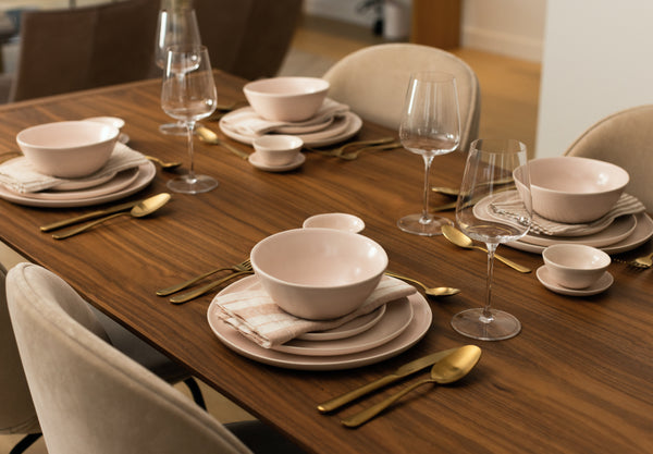
BLUSH PINK + DESERT TAUPE
“I chose Blush Pink and Desert Taupe together, which are two very tonal, neutral, lighter colors. The textile underneath is deep, darker, richer, vibrant, ornate; it’s a nice balance.”
BEACHGRASS GREEN + MIDNIGHT BLUE
“I put Midnight Blue and Beachgrass Green together to play on the idea of something very dark and very light mixing together. With that, I’d also do the same with anything else you’re putting on your table.”
SPECKLED WHITE + DOVE GRAY
“I chose Speckled White and Dove Gray because they’re both cool tones, which is nice paired with black flatware, also a cool tone. Then I love to add a punch of vibrancy, especially if you’re going more neutral.”
